Your company needs a design system and you don’t know it
A quick guide to starting a “Design System” from scratch, at the level of concept, UX design and web development.
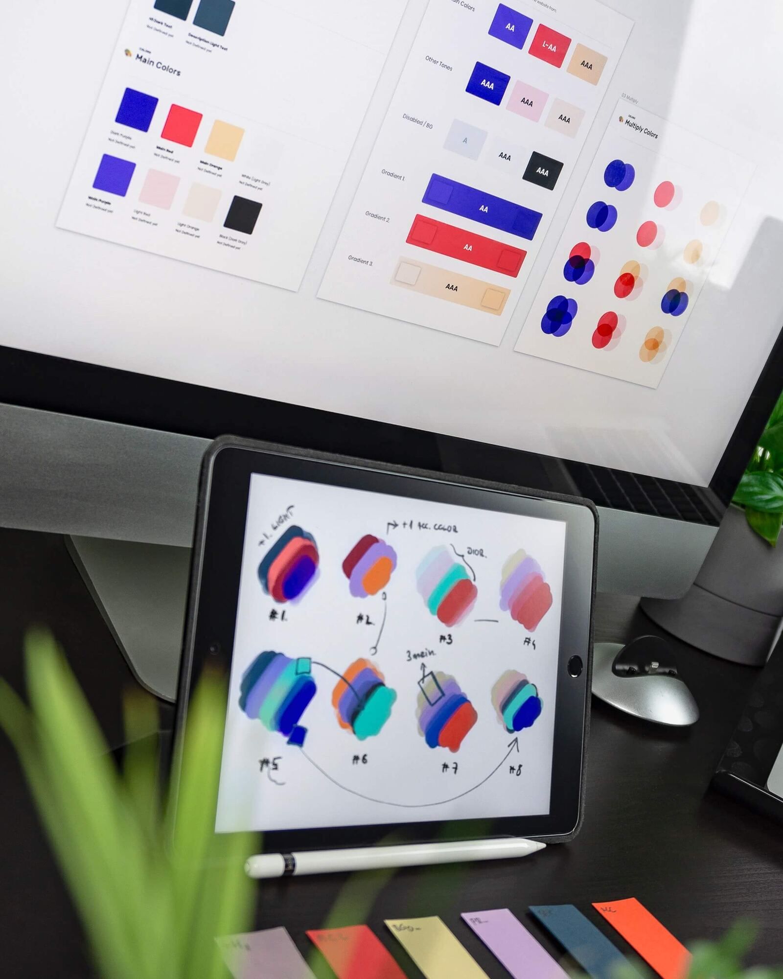
A quick guide to starting a “Design System” from scratch, at the level of concept, UX design and web development.
What a “Design System” is
A “Design System” is a set of rules, styles and principles that guide the creation of a consistent and efficient user experience in a company or organisation. It is important to bear in mind that a design system does not only refer to visual design, but also to user interface design and navigation.
The aim is to make sure that all of an organisation’s products and services look and work consistently, improving the user experience and the efficiency of development.
Advantages of using and adopting one
-
Consistency in the user experience
-
Saving time and money: A design system saves time and money in product development, because existing components and design principles can be reused instead of creating things from scratch every time.
-
Improved trust in the brand: A consistent user experience helps improve trust in the brand, because users know what to expect from a company’s products and services. Also, if a company changes its business strategy, the design system will need to be updated to fit the new aims and goals.
-
Improved development efficiency: A design system helps developers work more efficiently by providing a clear and consistent framework.
However, there are also some drawbacks to using a design system in a business context, such as the Cost and effort of implementation and Limitations on creativity. These two points more than outweigh the advantages described above.
The preliminary steps, the first steps, are the most important
If you want to hire a design agency or a design/UX department to create a design system in your company, you must first make sure of the following:
-
Identify the needs: Before hiring a design agency or a design/UX department, you must set the objectives and goals of the design system and determine which areas of your company will be affected by it.
-
Make sure that the agency or design team you hire works, or has worked, with design systems before; otherwise the deliverable may end up closer to a simple style guide than to a solid, dynamic and scalable structure.
-
Negotiate the terms of the contract. Both the budget, setting a schedule of deliveries, setting the responsibilities of each party and setting the payment terms.
-
Monitor progress: As the design system is implemented, it is important to monitor the progress of the project and make sure the objectives and goals set are being met. It is important to keep communication open and constant.
-
Assess success: Measure the impact of the design system on the user experience, on the company’s performance and on development efficiency.
Figma is the standard tool in 2023
Figma is an online design tool popular with designers and developers because of its real-time collaboration features. This lets team members work on the same file at the same time, which speeds up the design and development process. It also lets team members leave comments and make suggestions directly on the design, which makes communication and feedback easier.
Compared with other tools such as Sketch or Adobe XD, Figma is a fully online tool, which means you do not need to download a desktop application to use it and it can be accessed from any device with an internet connection, which makes collaboration and access from different places easier.
Align expectations between the Business, Design and Development teams
Cross-cutting product design
A “Design System” works as a cross-cutting lever; it requires a strategy, objectives and goals aligned across the different departments of an organisation.
For all these reasons, smooth communication between these departments is key to making a significant impact. It is advisable to set up an interdisciplinary team to work on the design system, and to establish a work plan and a delivery schedule. It is important to make sure the design system is reviewed and updated regularly to adapt to changes in the business strategy and to users’ needs.
Effective communication strategies for this

Set up an interdisciplinary project team
The project team must include representatives from the business, development and design departments. This will help make sure that all perspectives are represented and that the needs of every department are taken into account.
Common language
It is important to establish a common language between departments. This will help make sure everyone is speaking the same language and avoid misunderstandings such as:
-
Differences in vocabulary: Members of different departments may use different terms to refer to the same concepts, components or features, which can cause confusion and delays in the project.
-
Differences in expectations: Departments may have different expectations about how concepts, components or features should work, which can cause problems in implementation.
-
Lack of alignment between business objectives and design objectives: They may have different approaches to how concepts, components or features should work, which can cause problems in implementation.
Clear work process
It is important to establish a clear work process for developing the design system. This includes a schedule, a work plan and a tracking system to make sure all team members are aligned on the project’s objectives and expectations.
Encourage continuous feedback
It is important to encourage continuous feedback between the business, development and design departments. This will help identify and solve problems in good time and make sure the design system is being developed in line with expectations.
Use collaborative tools
Using collaborative tools such as Figma, Slack, Trello and Jira allows for more real-time communication, which will help make sure team members are always up to date on the project’s progress and can collaborate effectively.
Keys to good web design
Good design is made by professional teams, not by artists
Design is a process of problem solving. It is not about making things look pretty, but about finding solutions to specific problems. A professional design team will work to understand the business’s problems, the users and the objectives, and find effective solutions through design.
It requires technical skills. It is not just creativity; it also requires specific technical skills, such as web design, mobile design, user interface design, etc.
It is a collaborative process. Design is a collaborative process that requires the contribution of different perspectives, skills and experiences, such as graphic design, interaction design, user experience design, research design, etc.
Design requires feedback and validation. It is not a linear process but an iterative one that requires feedback and validation from users, stakeholders and experts, and it will use that feedback to improve and validate its designs.
Evolving or adapting your Corporate Identity
Corporate identity refers to a company’s personality, character and values, and it is reflected in its design and communication. When developing a new design system, it is important to consider how it relates to the company’s corporate identity: visual consistency, tone of voice, accessibility and flexibility.
Visual consistency
The design system must reflect the key visual elements of the corporate identity, such as colours, typefaces, icons and graphic elements. This will help make sure the design system is recognisable and consistent with the company’s brand.
Tone of voice
This refers to the use of language and a tone suited to the brand, as well as the inclusion of design elements that reflect the company’s values and personality.
Accessibility
The design system must be accessible to all users, regardless of their physical or mental abilities. This includes accessibility considerations in the design of the components and the functionality of the design system.
Flexibility
The design system must be flexible enough to adapt to the company’s changing needs and to market trends. This includes the ability to scale and adapt the design system for different platforms and devices.
“Design Tokens” are the solid foundations of every “Design System”
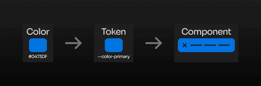
“Design Tokens” are a set of numeric and string values that represent the key visual elements of a design system, such as font size, colours, distances, shadows, etc. These tokens are used to ensure visual coherence and consistency across all the elements of a design system, from the user interface to the brand design.
Here you can see a list of the most representative “Design Tokens” in a design system for a company’s web products:
Colours
- Main brand colour
- Secondary brand colours
- Background colours
- Text colours
- Icon colours
- Action button colours
- Link colours
Typography
- Main font family
- Font sizes for the title
- Font sizes for the body text
- Font sizes for the subtitles
- Font sizes for the buttons
- Font sizes for the icons
Spacing
- Margin sizes
- Padding sizes
- Line sizes
- Shadow sizes
Icons
- Standardised icon set
- Icon sizes
Grid layout (grid or lattice)
- Column sizes
- Row sizes
- Space between columns and rows.
Animations
- Speed of the transitions
- Duration of the animations
It is worth mentioning that this list may vary depending on a company’s specific needs, but these are an example of the tokens that could be included in a design system.
Essential deliverables
Depending on whether a series of delivery phases has been set beforehand, this list may vary. Below you can see a proposal of the material to be delivered, from most to least relevant:
Design files. Editable files, such as Sketch, Adobe XD, Figma, etc. that were used to create the design system.
- Design Tokens: A set of numeric and string values that represent the key visual elements of the design system.
- Technical documentation: Technical documentation that describes how to implement the design system in code, including instructions for using the Design Tokens and the design components.
- Design components: A set of pre-built design components, such as buttons, forms, grids, icons, etc. that can be used in the design system
- Usage examples: Examples of how the design components and the templates are used in different types of web pages.
Other optional material, but of great value:
- Templates: Pre-built templates for different types of web pages, such as home pages, landing pages, product pages, etc.
- User tests: User test reports that show how users interact with the design system and any feedback they may give.
From Figma to code: now it’s time to implement it

Analysing the current front-end integration
Once the design in Figma is complete, it is time to move on to the next stage: implementing the design in code. This stage is crucial to make sure the final product matches the original designs and works correctly on all devices and platforms.
However, before starting the implementation, it is important to analyse the current front-end integration.
Is the development team currently using best practices and suitable technologies? Can the current designs be easily translated into code? Is there any problem with the current front-end architecture that could cause problems in the implementation?
Solving these problems before starting the implementation can save time and effort in the long run. For example, if it turns out that the development team is not using best practices, it may be necessary to make changes to the front-end architecture before starting the implementation.
Once the current problems have been analysed and solved, it is time to start implementing the design in code. It is important to follow the original designs closely and work together with the design team to make sure the final product matches the original designs and works correctly on all devices and platforms.
Refactoring and evolving the Frontend layer
As a product evolves, problems are likely to arise in the Frontend architecture and in the implementation of the design.
Refactoring the Frontend means improving and updating the structure, the code and the architecture of the Frontend layer of an application or website. This can include restructuring the existing code to improve its readability and maintainability, updating the technologies and libraries used to take advantage of the latest features and improvements, or changing the architecture to adapt to changes in business requirements.
Start small, think big

The concept “Start small, think big” is applied by creating a scalable, modular structure. Instead of trying to cover the whole system at once, you begin with a small set of components and keep building on them as more are needed.
The idea is to start with the basic, fundamental components, such as buttons, headings, forms, etc. and build on them to create more complex components. This makes it possible to test and improve the components as they are built, which helps detect problems and find solutions as the project moves forward.
The Frontend layer should be agnostic to the type of backend frameworks it uses
The Frontend layer should not depend on the Backend framework. This is important because it gives the company flexibility in its choice of Backend and lets it change it if necessary without affecting the Frontend layer. This allows Frontend developers to work independently of Backend developers, which improves development efficiency and reduces code conflicts (and vice versa).
To be very brief, we could say that the three legs that hold up the Frontend are the generated HTML, the applied CSS and the JavaScript that interacts and requests data from the backend.
Every web site or application architecture usually has what we call a “template system”. It is made up of files that contain the design and basic structure of a page, such as the header, the footer and the navigation.
Web developers can use these templates to create new pages quickly and consistently, without having to create the design and structure from scratch every time. A template system can also include variables and reusable components.
Finally, it is the browser that interprets the HTML generated by this system, displays it in a certain way thanks to the CSS, and updates and interacts with the user thanks to the JavaScript. All of this allows web developers to create customised pages using predefined dynamic elements.
So, what deliverables should I ask the development team for in order to implement the development system?
If you have a Frontend Tech Lead in your company, trust them; otherwise, read the following points
Key files generally managed by current Frontend frameworks such as React, Angular or Vue.
-
HTML files: The HTML code that defines the structure and the content of the design system’s pages.
-
CSS files: The CSS code that defines the visual presentation of the pages, including text styles, colours, images, etc.
-
JS files: The JavaScript code that provides interaction and functionality on the pages, such as form validation, navigation, animations, etc.
Documentation and configuration
-
Code documentation: The documentation of the code, which explains how the code works and how it should be used.
-
Configuration files: configuration files needed for the design system to work properly, such as the webpack configuration file.
Testing and, optionally, performance testing
-
Unit test files: a set of automated tests used to make sure the code works as expected.
-
Performance report: A report that details the performance of the design system, including information about load time, response speed, memory use and compatibility with different devices and browsers.
This article is focused on less technical, more popularising aspects, which means the information is presented in a way that is easy to understand for the general public. Instead of going deep into technical details, the article concentrates on explaining the concepts clearly and accessibly for everyone.
Keep reading
Learning Web Components
What are Web Components? Web Components are a group of standard web technologies that let you create reusable custom elements with their own structure, style and functionality, completely encapsulated and isolated…

Analysis of the popurrí of La Oveja Negra
I'm back once again with a literary analysis with philosophical overtones (the music I leave to the musicians), written from the subjectivity of someone who is trying to offer a view of the text and subtext without fanaticism or academicism.

Analysis of the popurrí of La ciudad invisible
Analysis of Antonio Martínez Ares's popurrí this year, 2023, with his comparsa «La ciudad invisible», focusing on the performance, musically splendid and full of comparsa details from the 1990s.